CASE STUDY
SANTA FE INTERNATIONAL FILM FESTIVAL
THE PROBLEM
This little festival, with a 10 year history, has grown to International status. With this growth and the 10 year anniversary upon them, SFiFF wanted to update and elevate their branding. Initially, the festival Poster was the place to start. There was a long legacy of highly independent art as it related to the Indie Movie Festival space.
A BRIEF HISTORY
THE OPPORTUNITY
Throughout the history of the Festival, this Dog, personified by kicking back and watching movies, has become the distinguishing icon. Finally in 2017, SFiFF refined the Dog in a much simpler way. Liesette Paisner Bailey and her brother Jacques Paisner, founders of the festival, reached out to CurtDoty.co to see how the poster could be better formatted and build some brand recognition moving forward.
THE SOLUTION
Beyond leveraging the Dog in whatever capacity, SFiFF lacked a strong logotype like other festivals. This could become an important branding element to use year after year to build recognition. Curt designed the final logotype that is now a pillar of the brand.
THE EXPLORATION
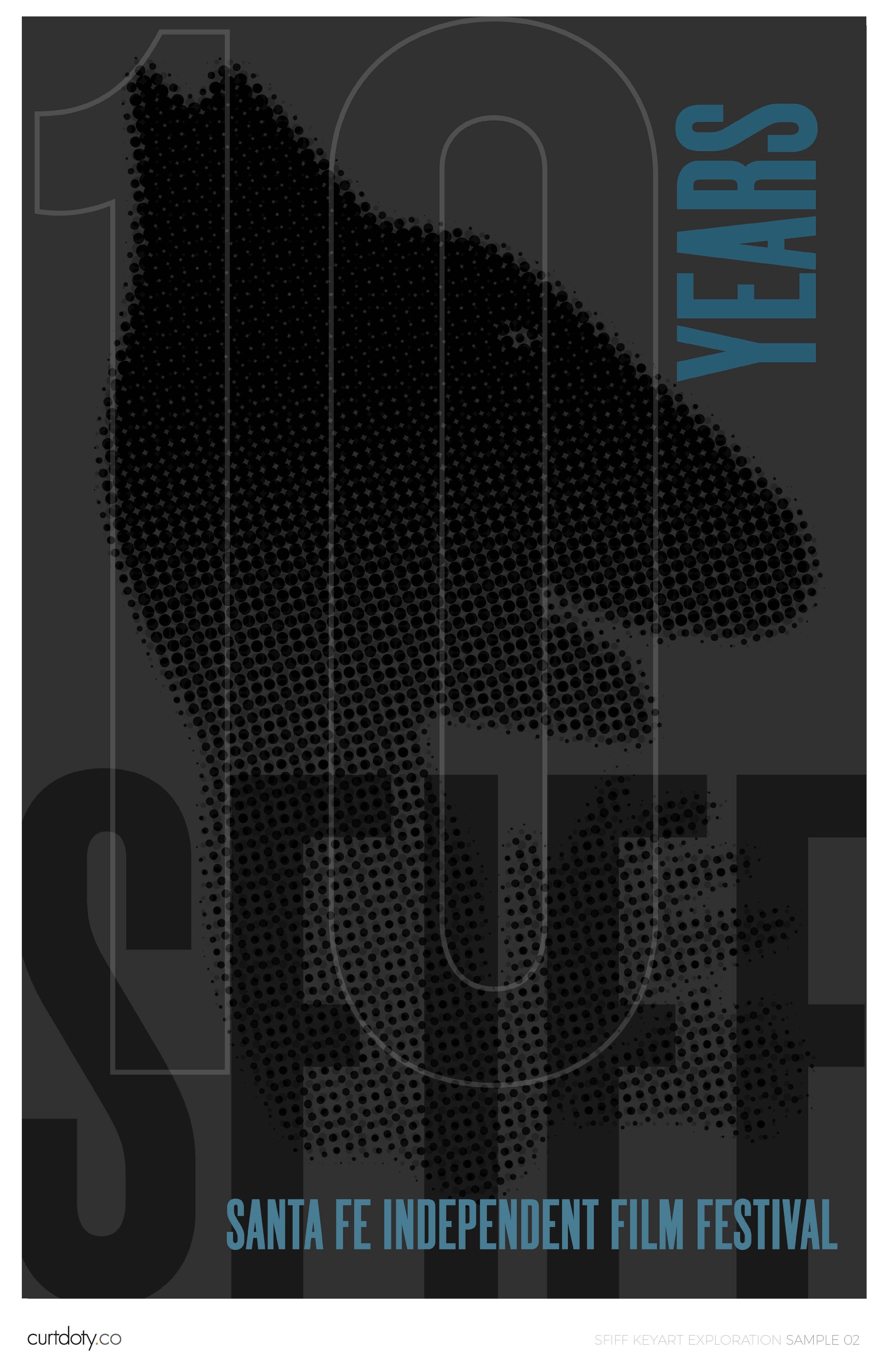
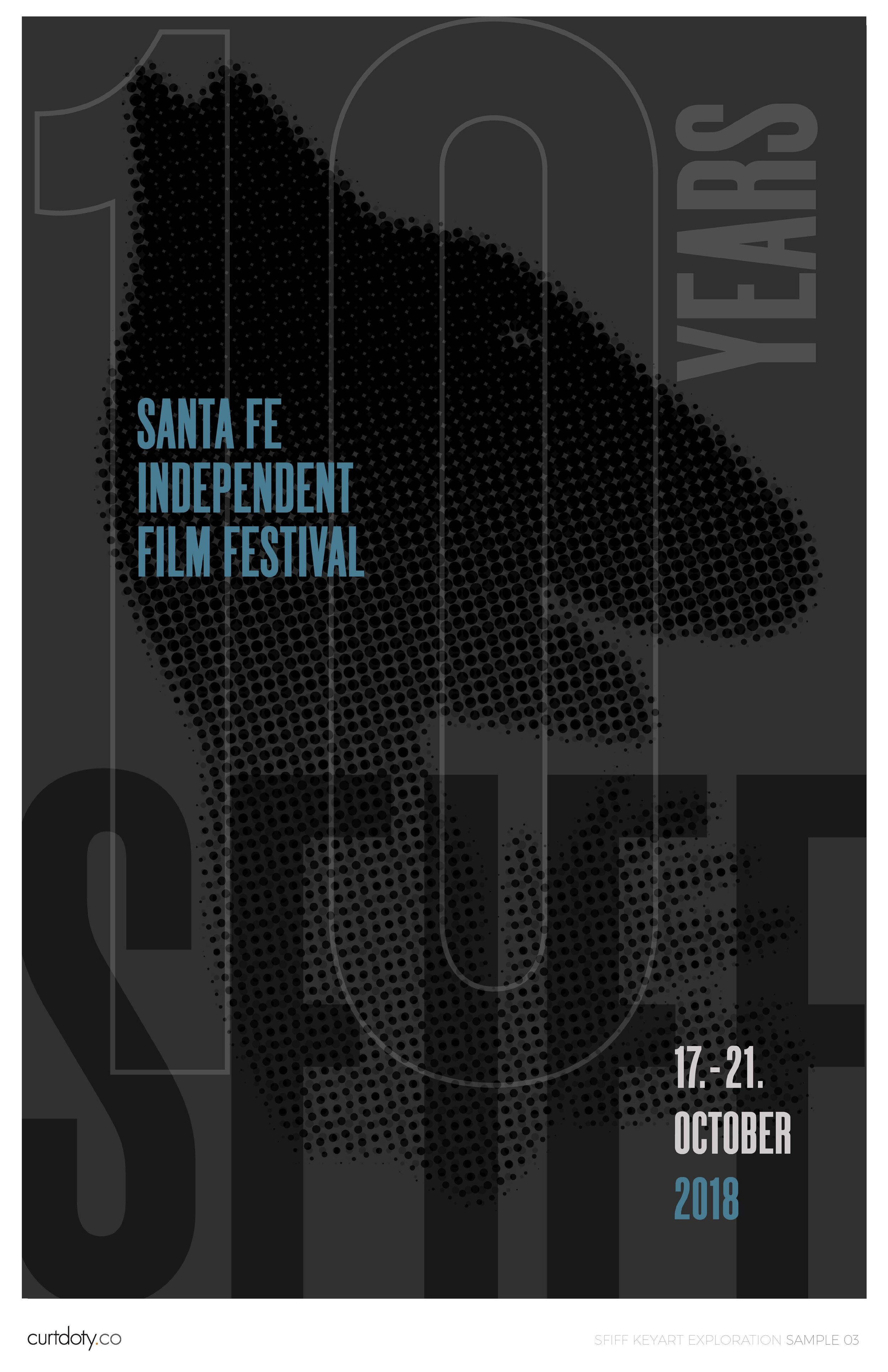
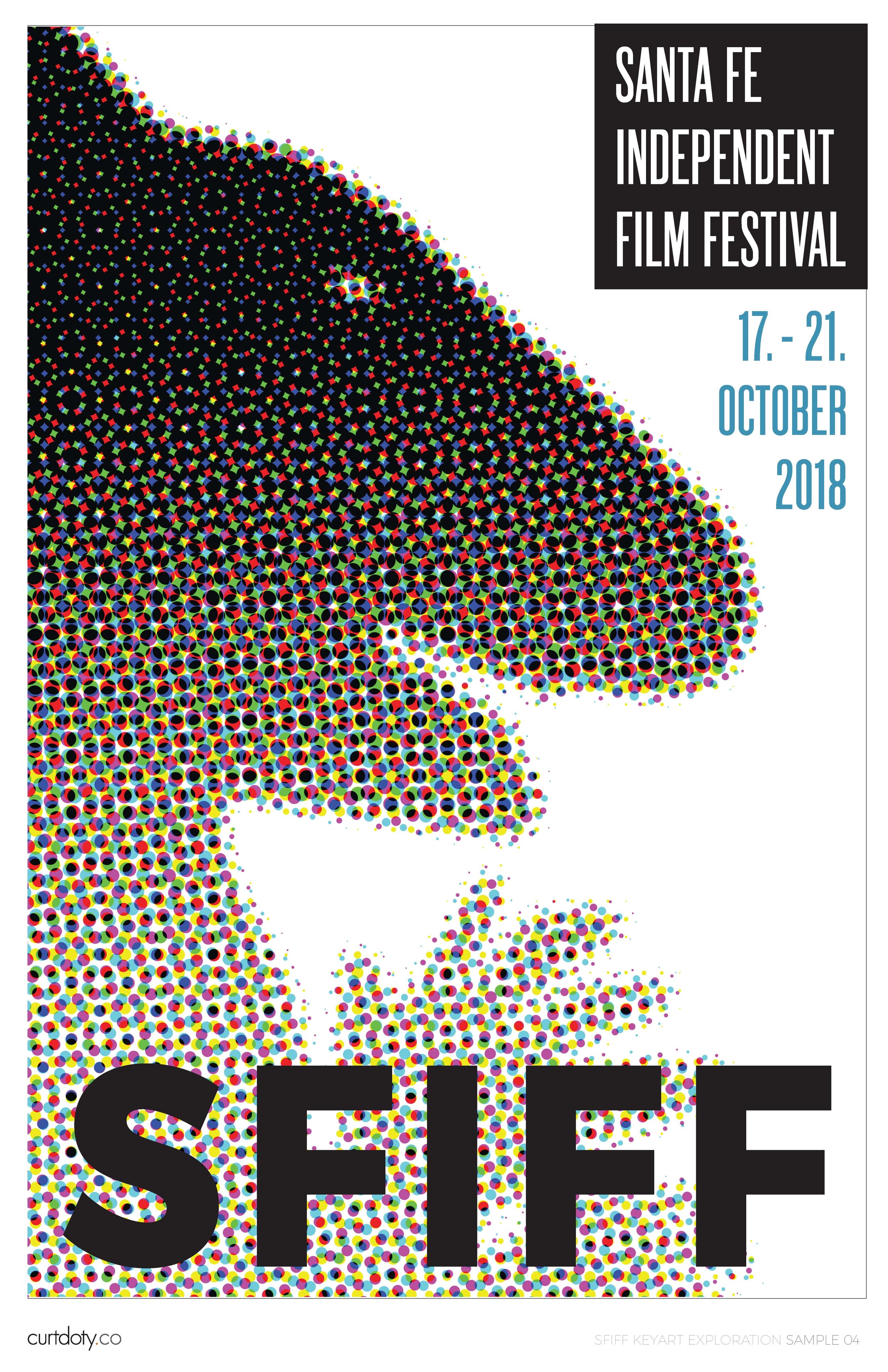
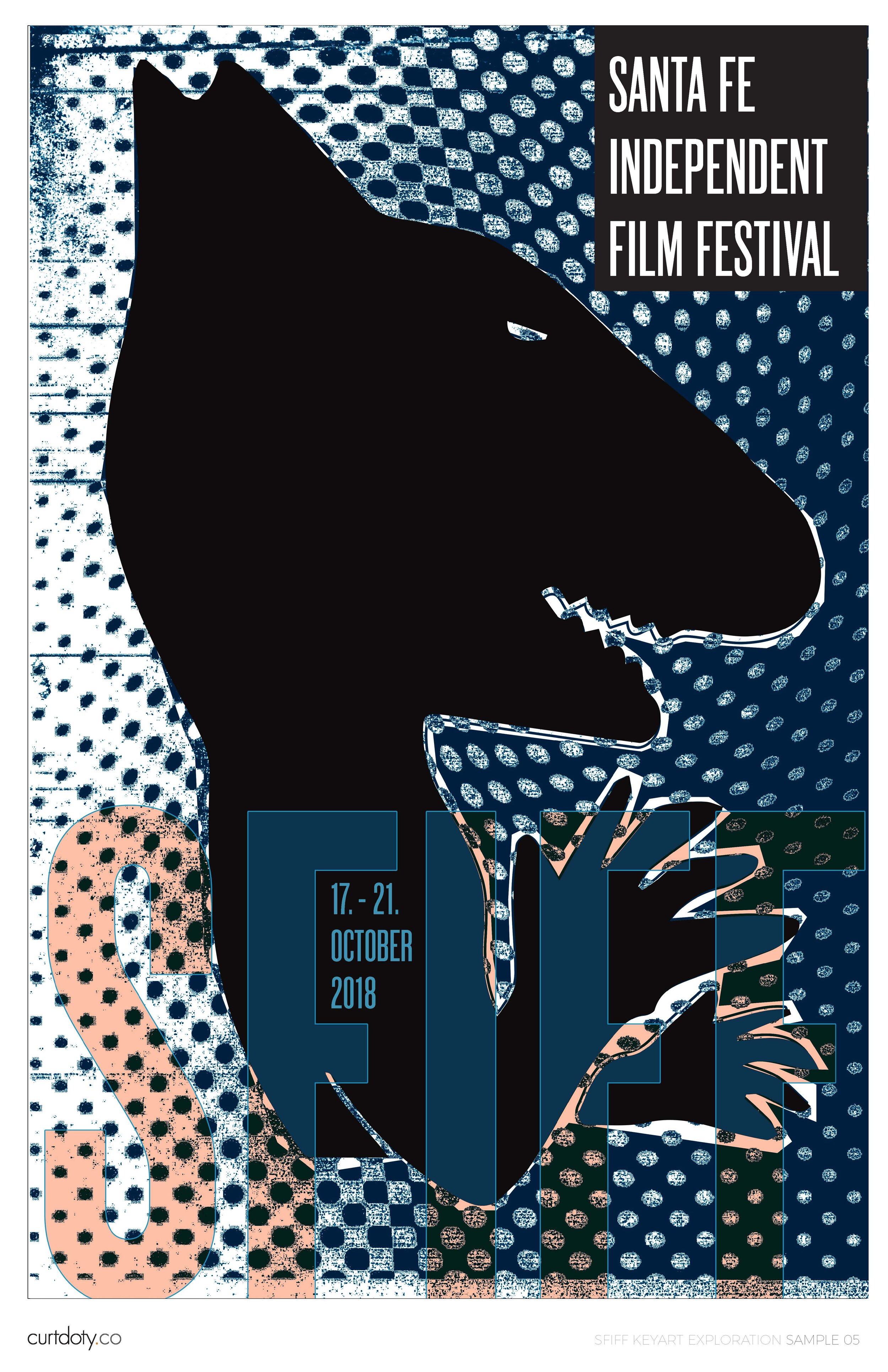
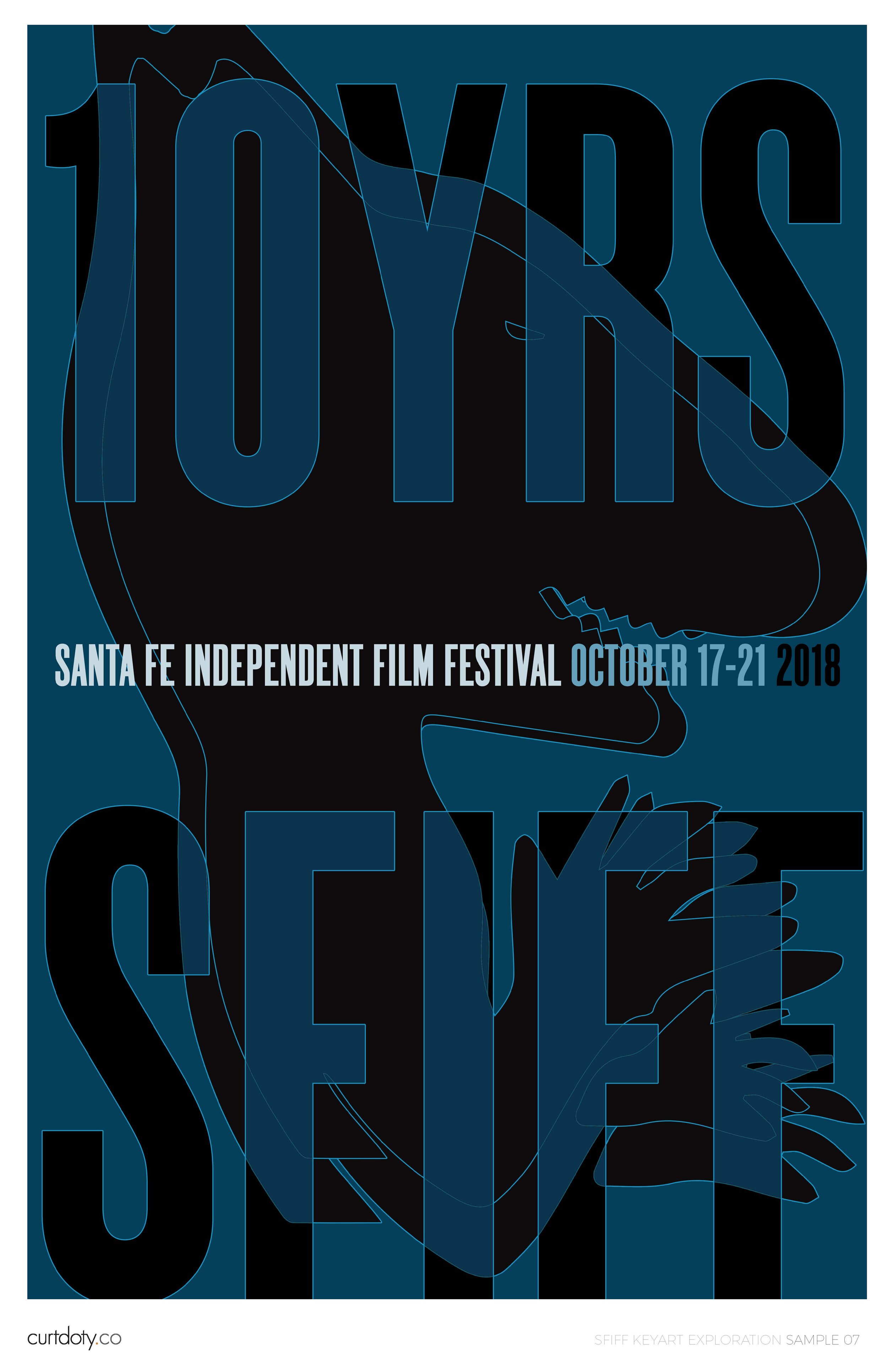
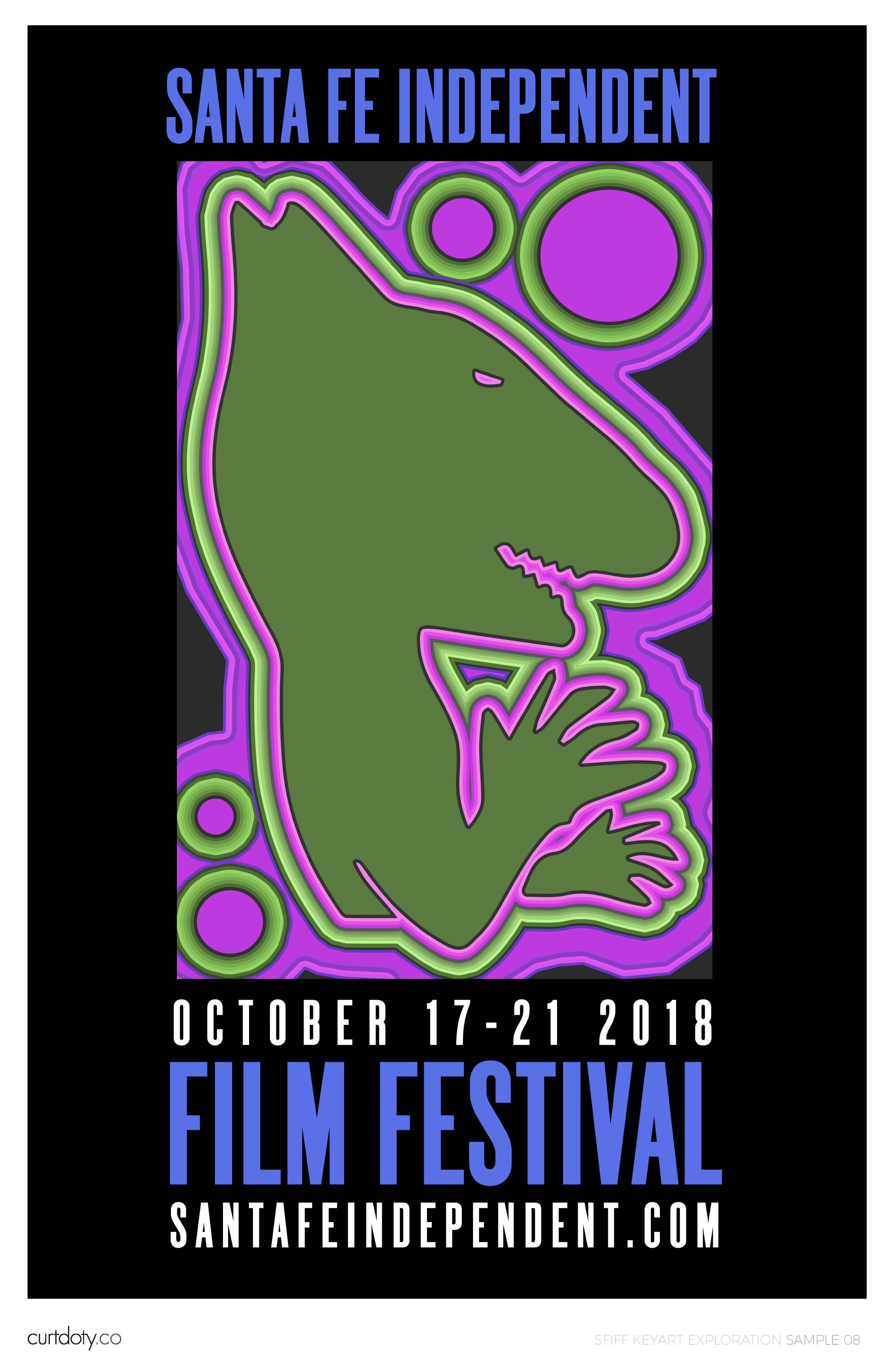
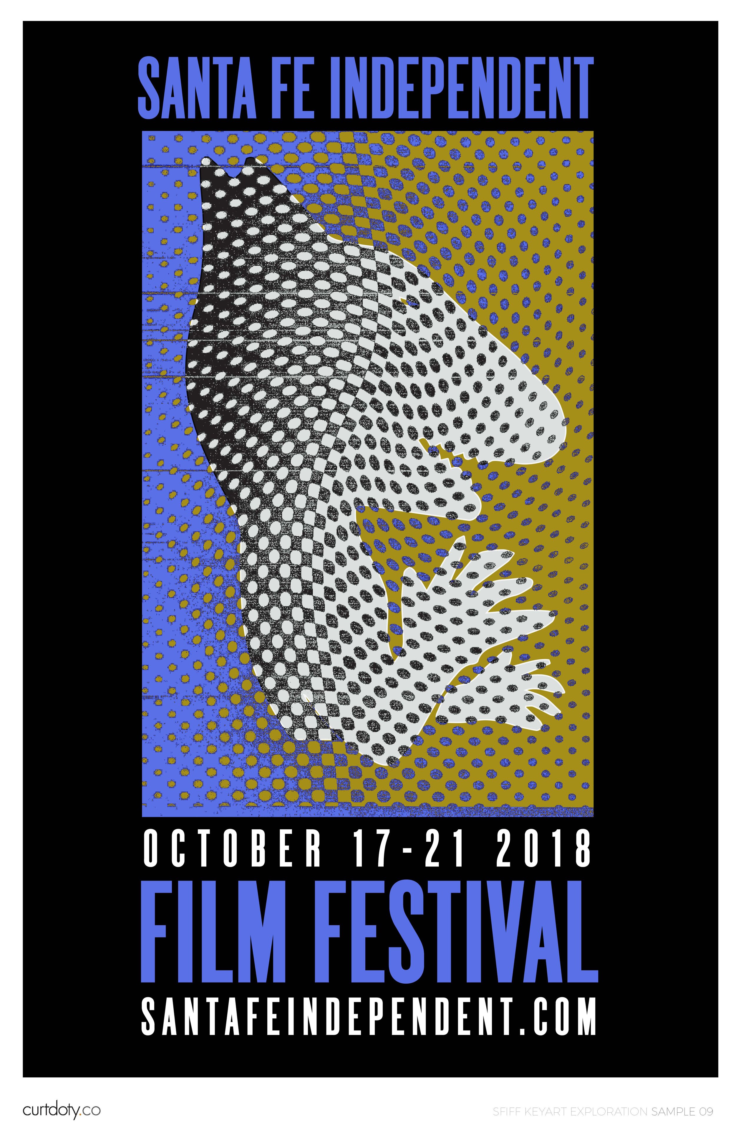
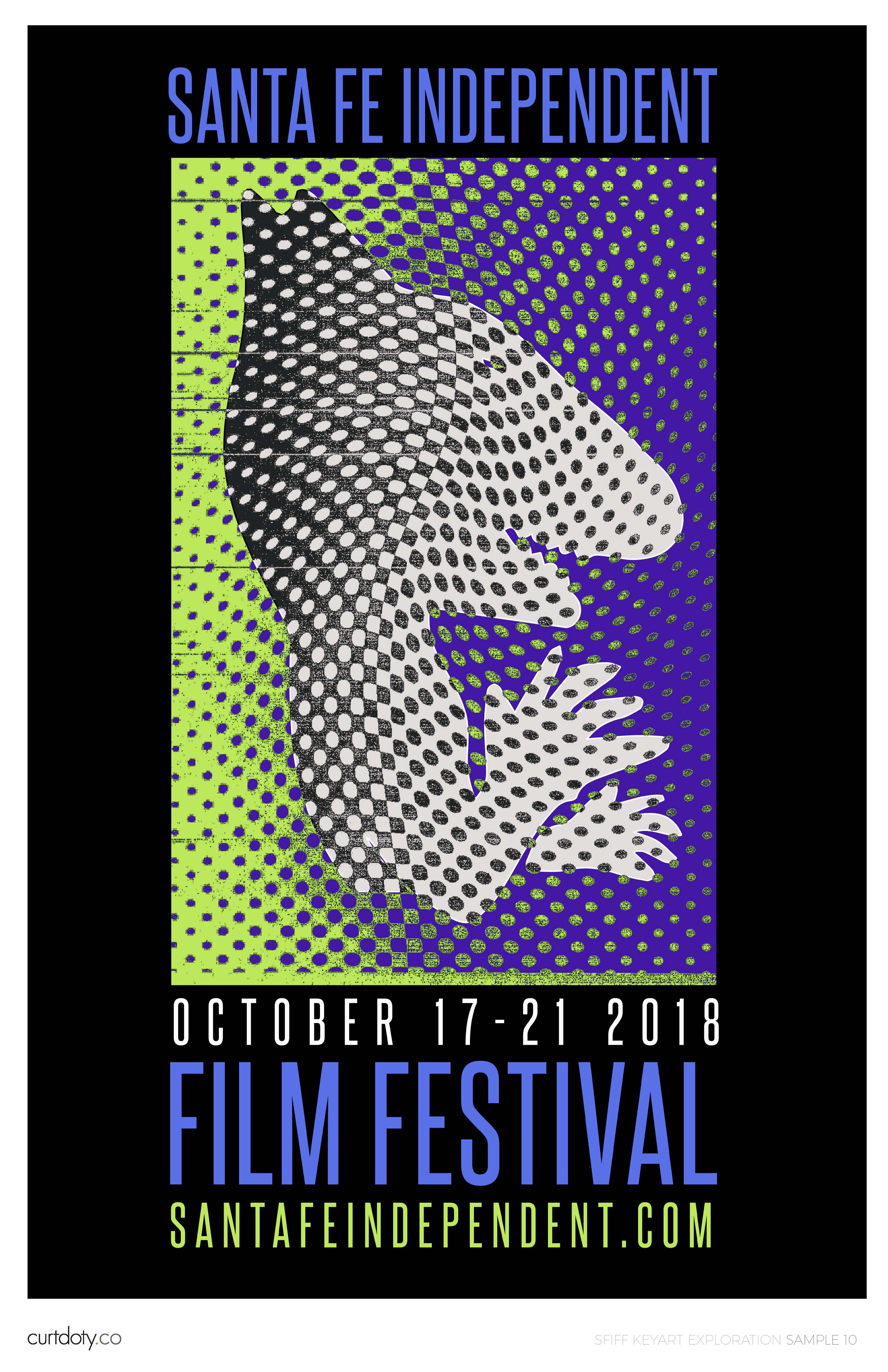
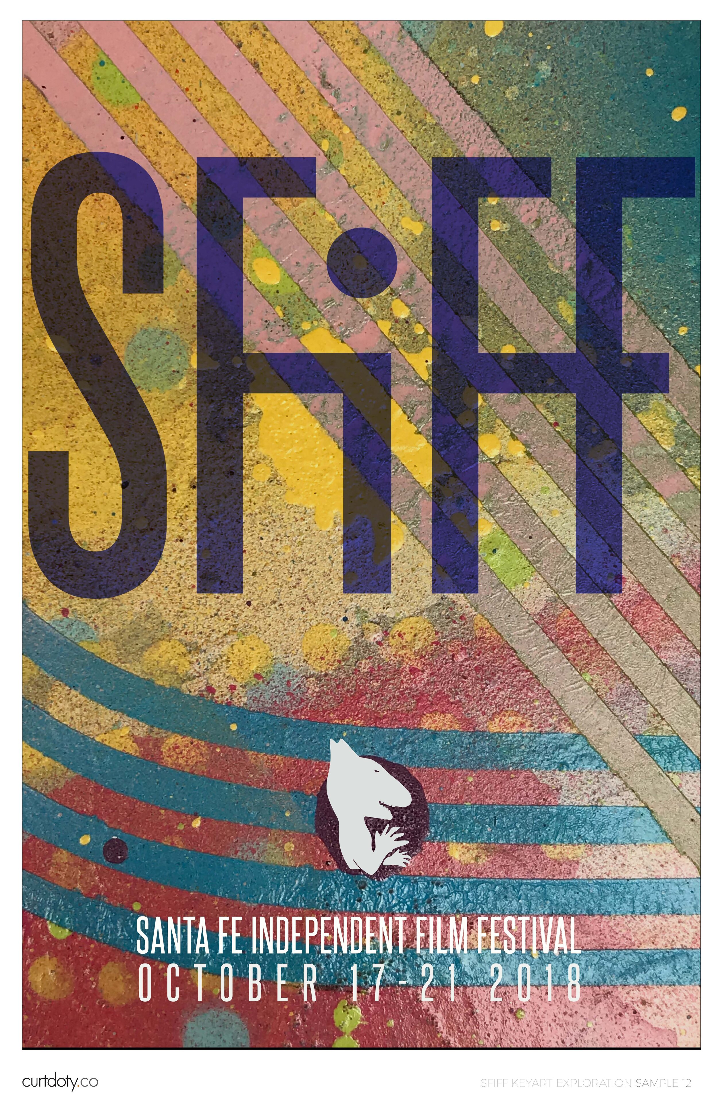
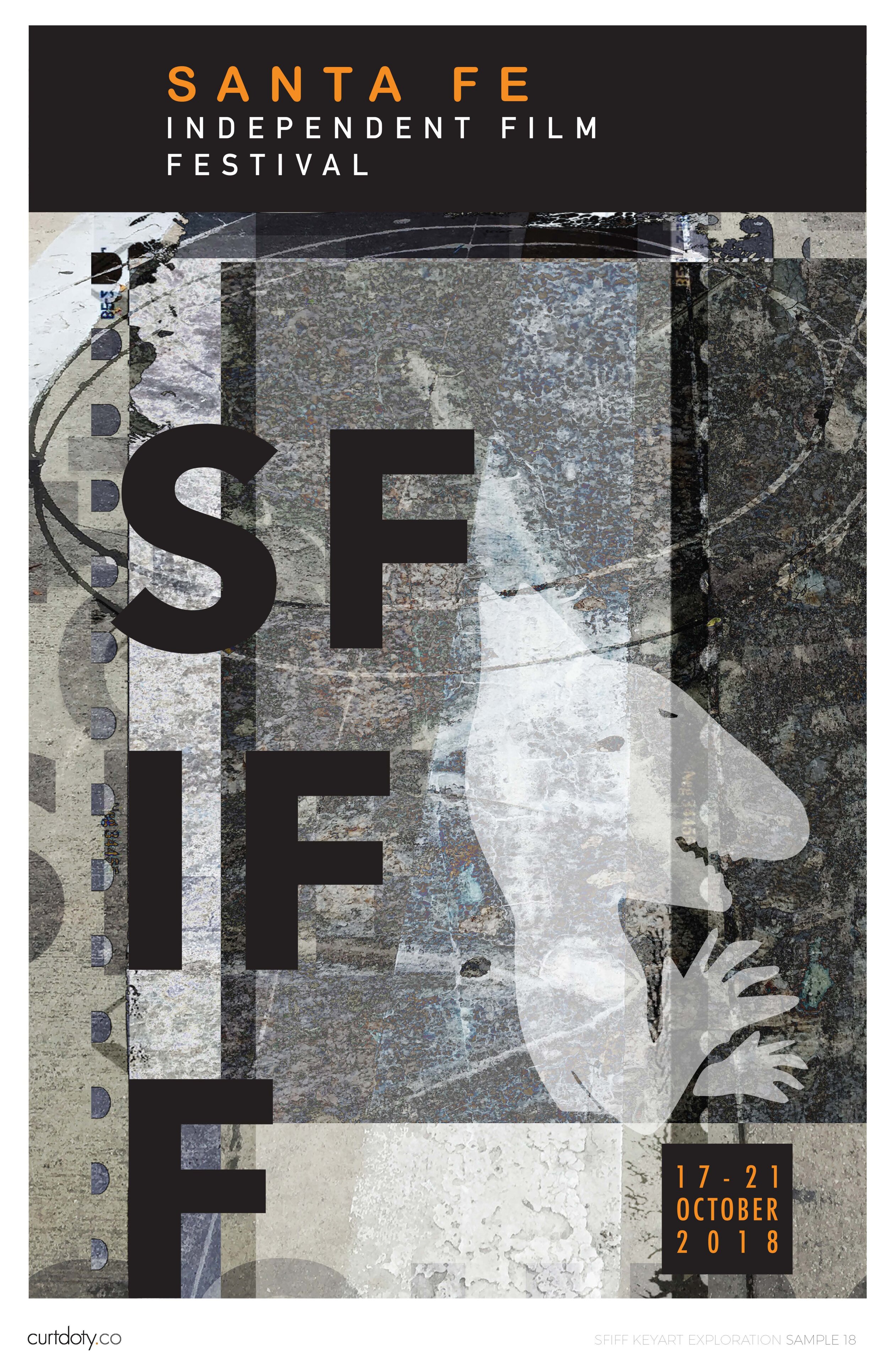
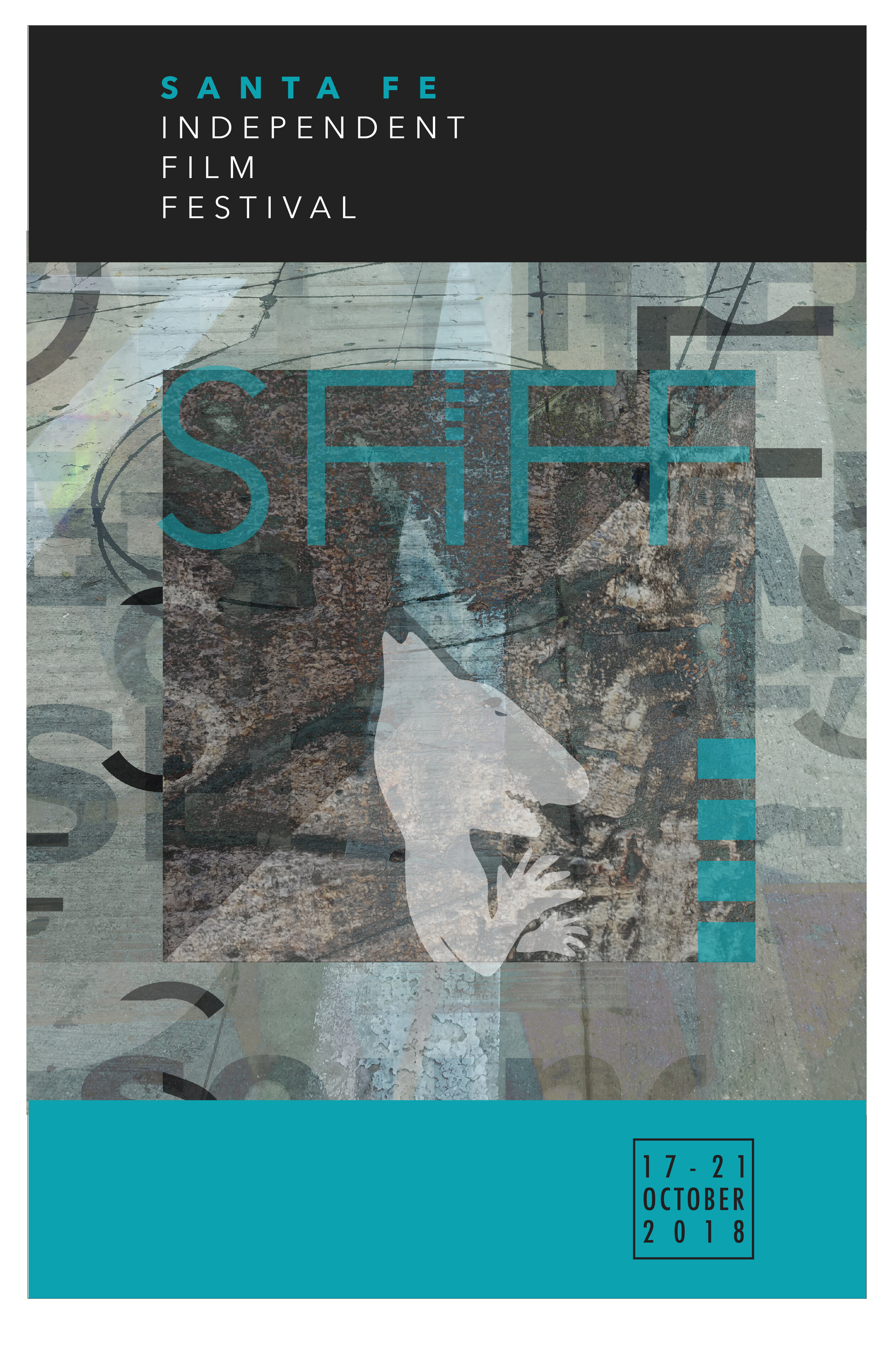
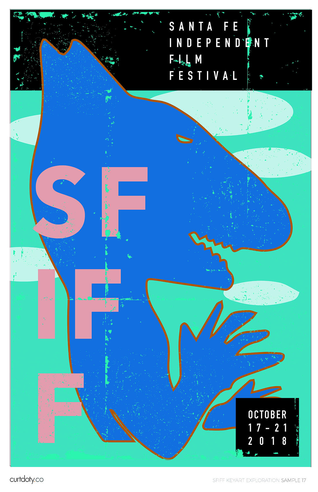
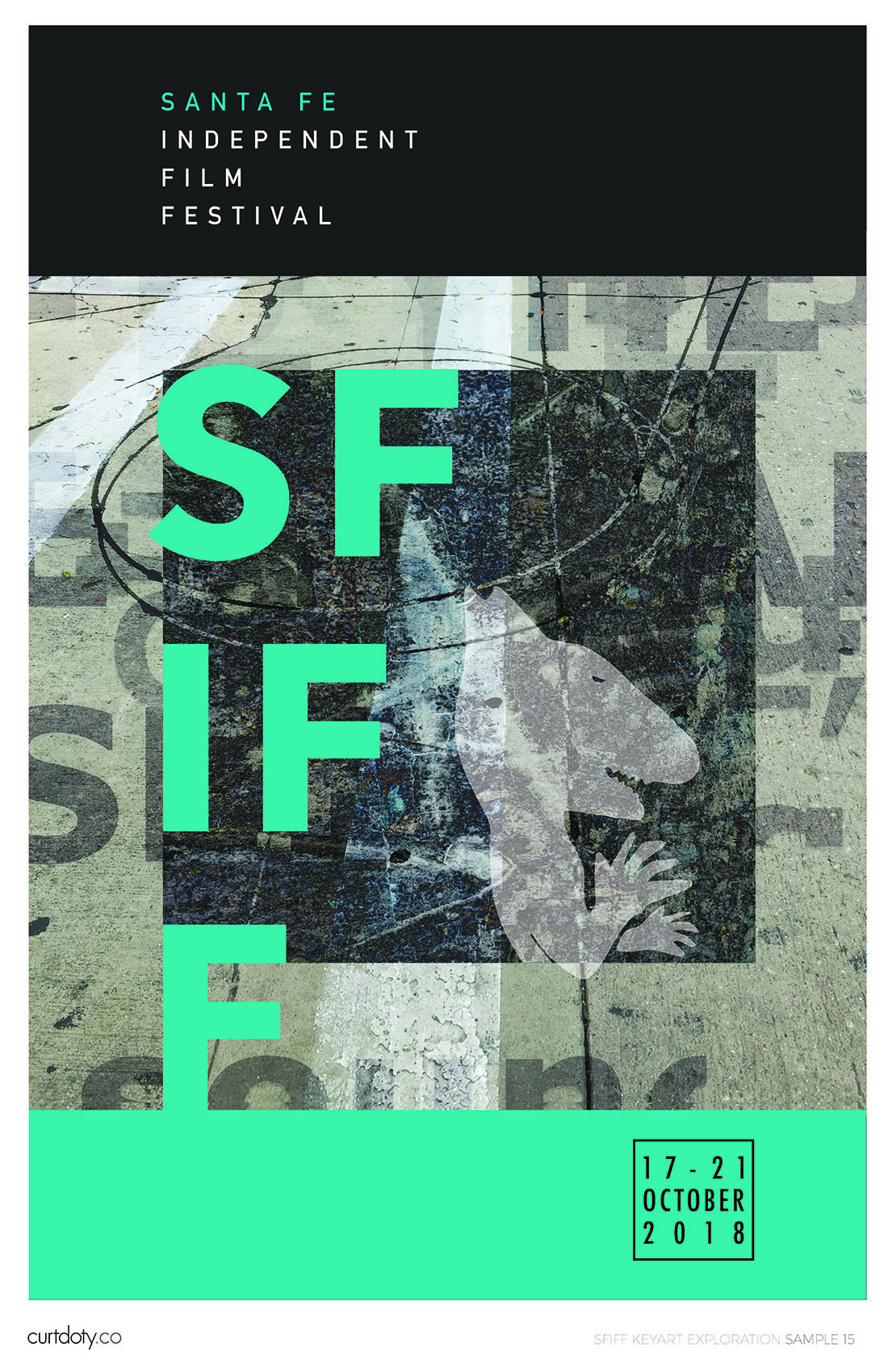
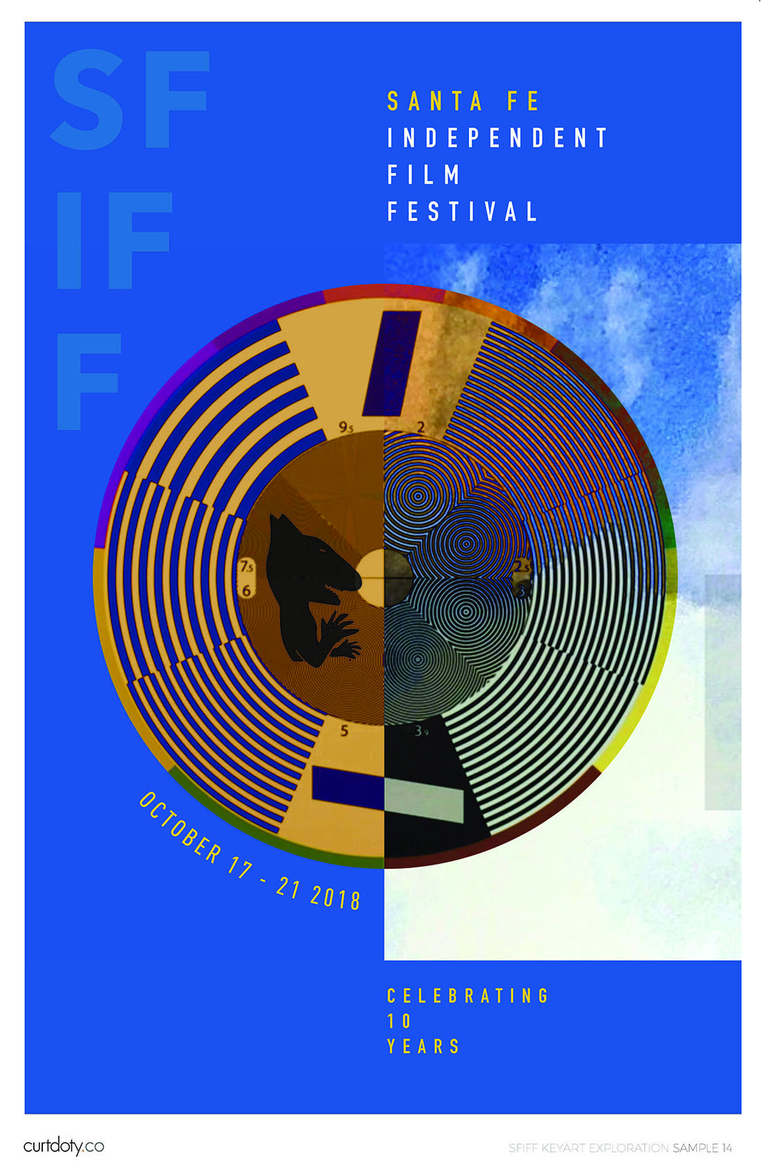
We wanted to play up and down the prominence of the dog and demonstrate how a strong logotype could be integrated.
POSTER DEVELOPMENT
THE WINNER
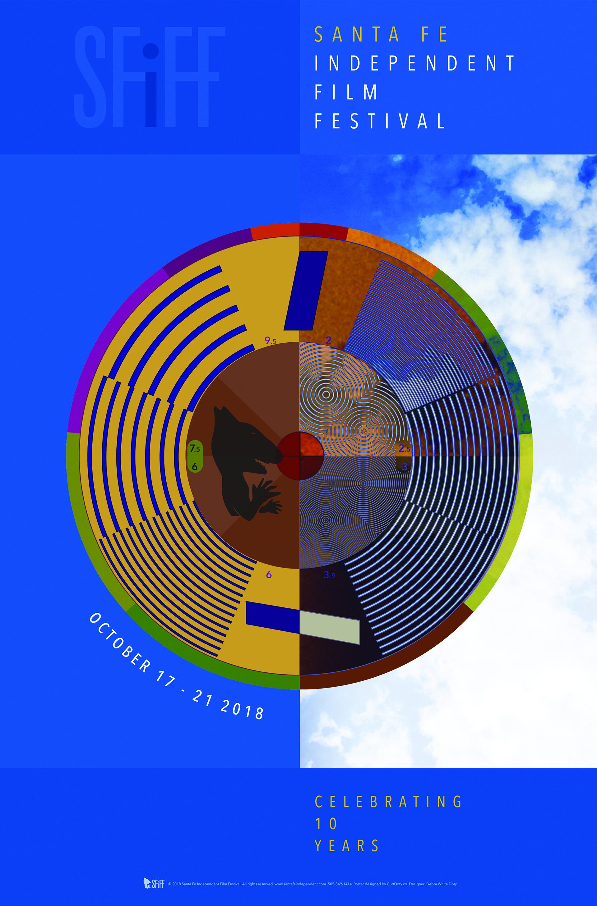
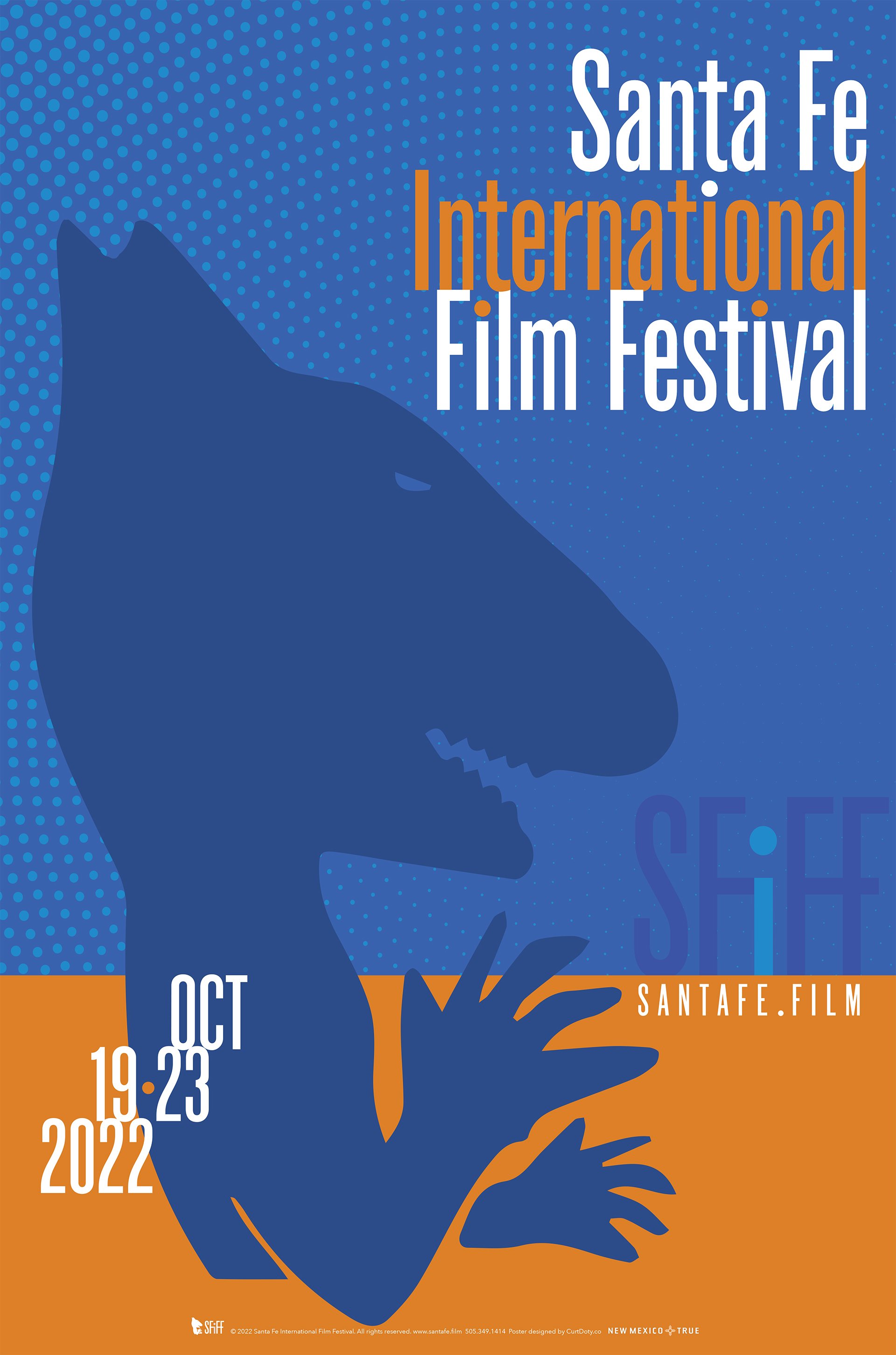
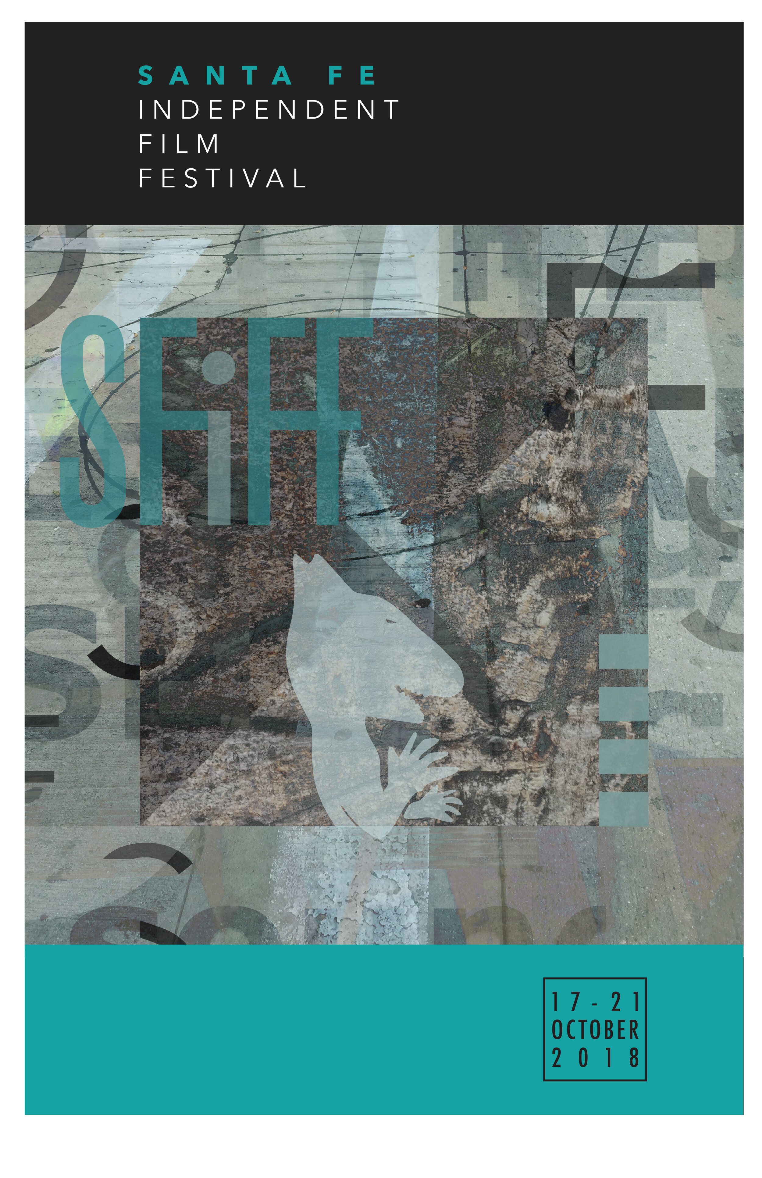
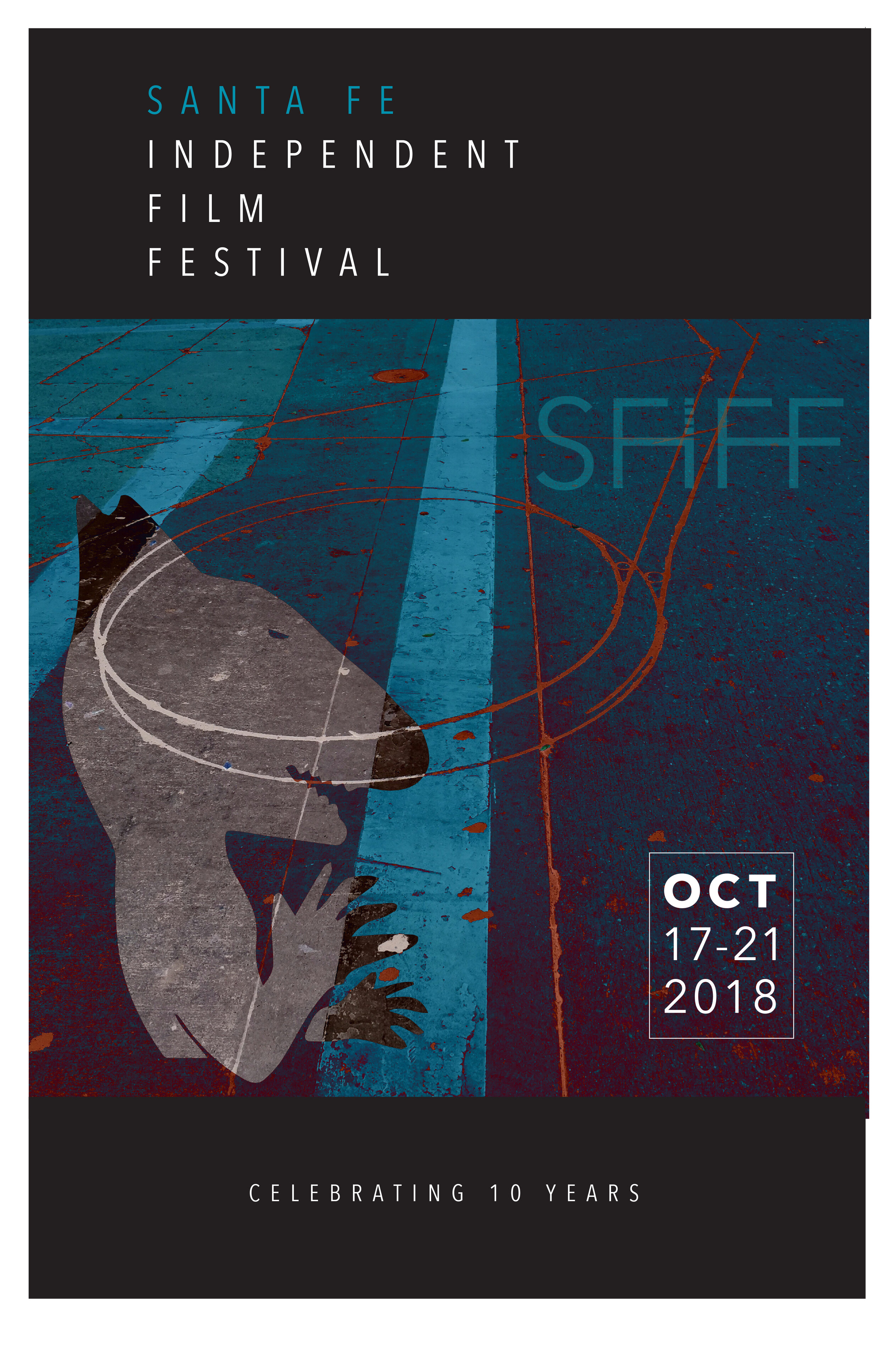
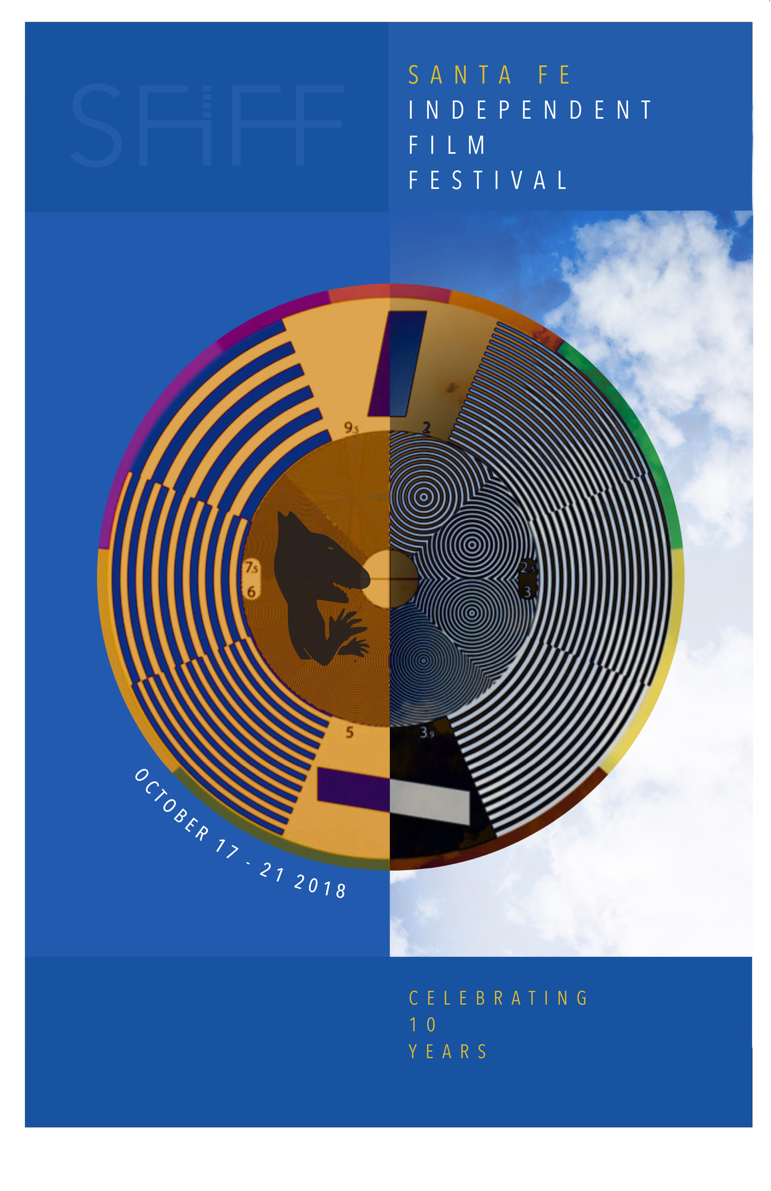
Lead Art Director Debra White Doty’s concept won. The intricate pattern is from a cinematographers focus grid and reimagined to echo the patterns of New Mexico’s native American heritage of basket weaving. It feels like New Mexico’s skies and elevates the brand to an almost museum quality approach to a commemorative poster.
“Curt and Debra were very thoughtful and professional when rebranding and designing a logo and press materials for the 10th Annual Santa Fe Independent Film Festival. They were able to solve longstanding and ongoing issues, by cafefully listening to SFIFF concerns and guidelines, then by providing several options and layouts for marketing materials.”
THE WEBSITE
With the new key art and logotype in place, the next challenge was to redesign the website. It had not received any functional update in years. Though it was responsive, our analysis was that it did not take advantage of the full raster, videos were buried and overall it was not a visual experience. A tragedy as the festival is all about the wondrous imagery of these International films. We went through a site audit and site map process which clarified and simplified the navigation. Built on Squarespace, we redesigned the site to meet all the strategic goals, which included a visual press archive, homepage full raster video with a trailer CTA, and multiple galleries of finalists and winners. In the process, all of the SFiFF social channels were cleaned up and rebranded. We CMS trained the staff and SFiFF took over governance of the new site. An exciting chapter for the brand.
CLEAN AND MODERN
YEAR 2
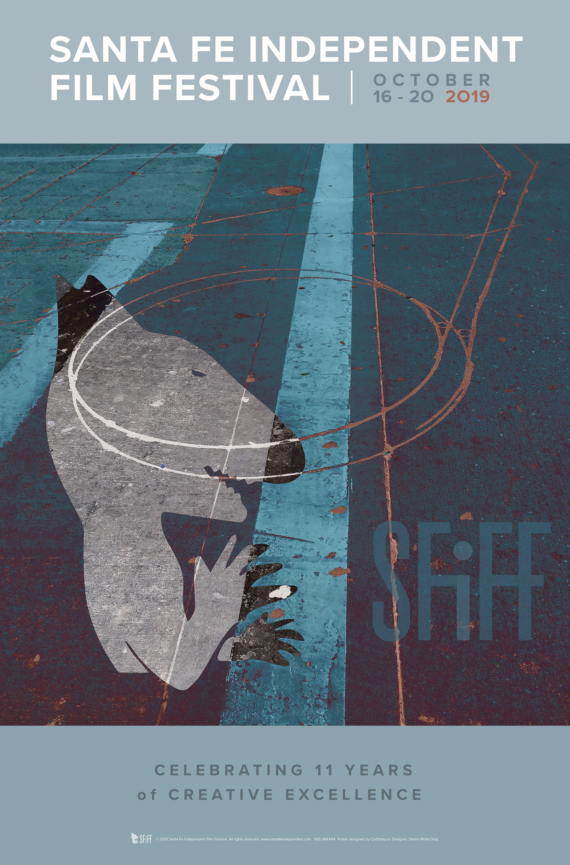
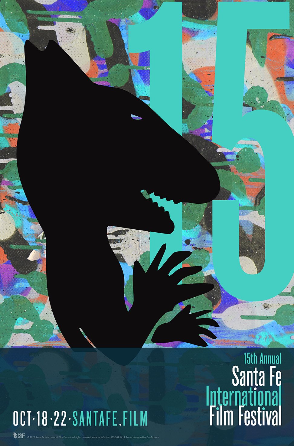
SFiFF called us back to create the poster for the 2019 festival and because our initial exploration was so robust and well received, we revised an earlier comp, updated the copy and a new poster was born. Debra White Doty’s solution was a little more grittier than last years, but ultimately balanced the grit with class with a muted palette.
THE UPDATED WEBSITE
Over the Years
SEE OTHER CASE STUDIES
ADDENDUM
Looking for Corporate Identity or a Brand Evolution? These services are provided through my paid consultancy. Click Here.
Looking to learn how to PIVOT your company for growth? Click Here.
Are you a StartUp? Click here to find out about our Startup Accelerator.
Credits
Debra White Doty
Richard Downs
Unsplash
Special Thanks to
Jacques Paisner
Liesette Paisner Bailey
Jena Braziel
Stephanie Love
Allie Salazar







![FIN_POSTER_HALFSIZE[1][1].jpg](https://images.squarespace-cdn.com/content/v1/5505b92de4b07d153dd0bf27/1570830104469-9I29SQ0SD2RUJQ2HSS84/FIN_POSTER_HALFSIZE%5B1%5D%5B1%5D.jpg)


